Monospace Overchoice
CONTENTS[Addendum: corresponding Reddit comments]
I needed a typeface to display code on this site. That task morphed into this post.
Getting Started
Overchoice…a cognitive process in which people have a difficult time making a decision when faced with many options.
Every programmer at some point chooses a typeface for coding. Perhaps you are satisfied with your editor’s defaults (I envy you). Maybe you are a typophile or perfectionist. Good luck if so: no programming-related domain is complete without endless arguments over implementation details: “X is better than Y”; monospace vs. proportional; ligatures vs. not; bitmapped vs. vector.
My desiderata in choosing a typeface to display code on this site:
- Monospaced
- Scalable, not bitmapped
- Narrower width than typical
- Disambiguates similar glyphs like
il1andoO0 - Regular (book) and bold weights with an italic for each
- Flawless
woffandwoff2versions - Reasonable (to me) licensing if commercial
Width is an especially important criterion: analytics indicates site traffic is 49% desktop vs 51% mobile. Narrower typefaces fit more code on screen which benefits mobile and paper alike.
Candidates
Filtering on the above criteria, a number of commercial and free typefaces fit the bill (alphabetical order):
- Anonymous Pro
- Decima Mono
- Envy Code R
- Input
- Iosevka
- Monoid
- PragmataPro
- Roboto Mono
- Source Code Pro (and derivative Hasklig)
- Triplicate
- Vera Sans Mono (and derivatives DejaVu Sans Mono, DejaVu Sans Code, Hack, Menlo)
Several otherwise great typefaces lacked one or more of my requirements and did not make the cut:
| Name | Disambiguated | Book+Bold | Italics | woff{2} | Licensing |
|---|---|---|---|---|---|
| Fira Mono + derivatives | Yes | Yes | No | Yes | Yes |
| M+ Family | Yes | Yes | No | No1 | Yes |
| TheSans Mono | Yes | Yes | Yes | Yes | No2 |
For Apple fans: Monaco lacks both italic and bold while Menlo is already represented since it’s a Vera Sans Mono derivative.
Triplicate, a font “[u]nlike the usual monospaced snoozefest”3, didn’t make the cut for my own arbitrary aesthetic reasons. Sorry Matthew.
How They Look
Below are the candidate typefaces at 18 points (except Monoid as noted below) rendered4 on Windows 7 and MacOS 10.12. Please forgive slight color and image size differences.
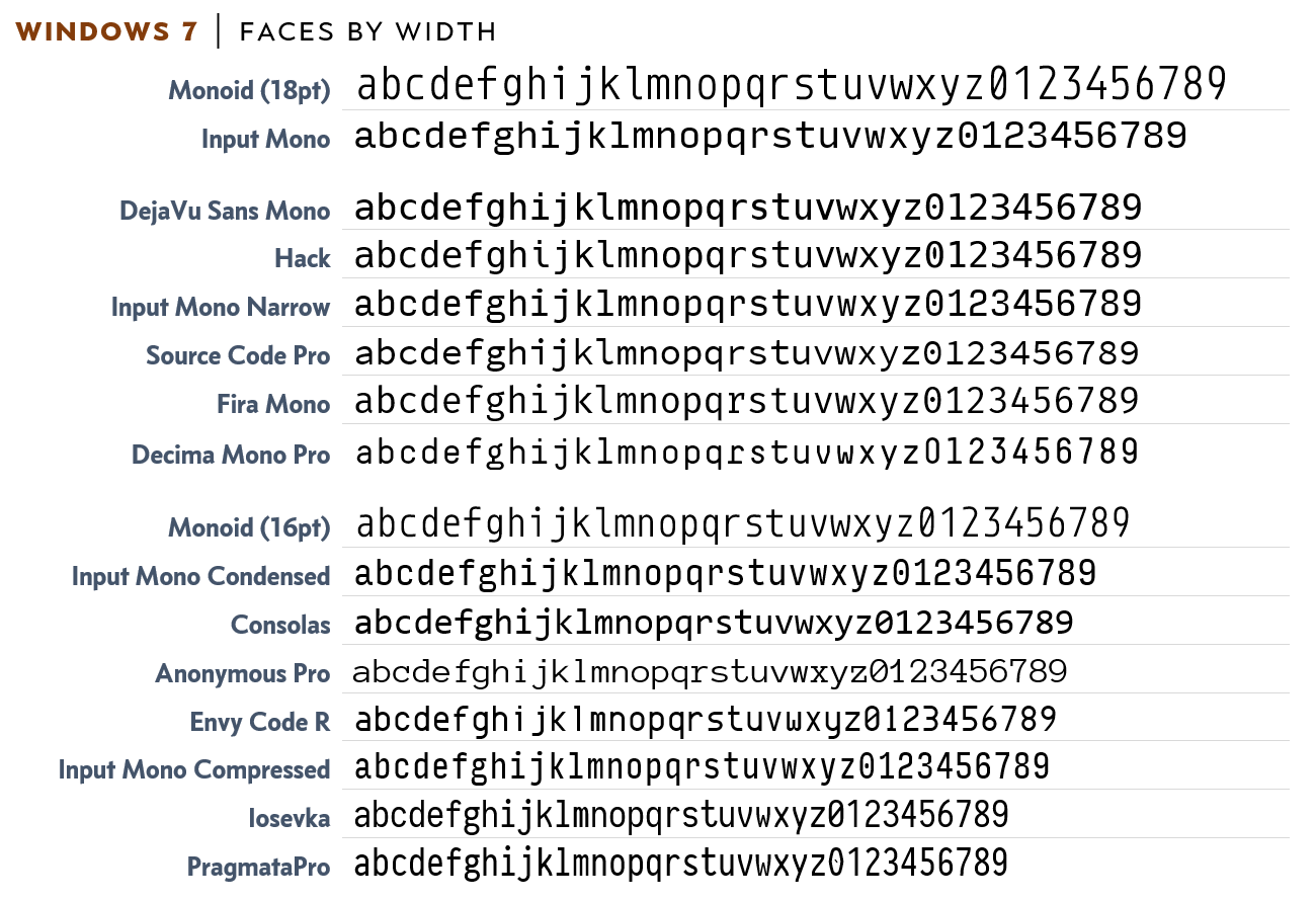
Figure 1 - Typefaces on Windows 7; 18pt unless otherwise noted (click to enlarge)
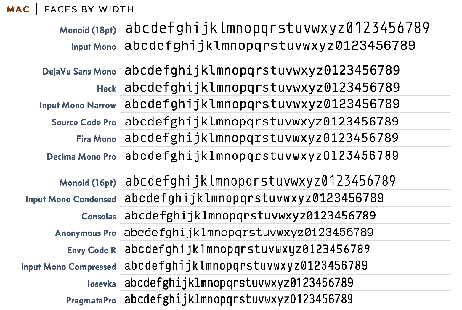
Figure 2 - Typefaces on MacOS 10.12; 18pt unless otherwise noted (click to enlarge)
Observations:
- Monoid is big, really big. Its 18 point form so dwarfs the others I suspect an inadvertent error or typo in its definition.
- A cluster of Courier-sized cousins: Decima Mono Pro, DejaVu Sans Mono (and other Vera derivatives), Fira Mono, Hack, Input Mono Narrow, and Source Code Pro have identical metrics. They are drop-in replacements (size-wise) for Courier and Courier New.
- Consolas is much more compact than I realized. Windows users that have unconsciously habituated to its compact form may find the above Courier-sized faces too wide.
- PragmataPro and Iosevka win the prize for most compact monospace typeface.
- For the observant: Decima Mono Pro does have a slashed zero. It’s available as an OpenType alternate and I forgot to enable it for the screen-shots.
Given I’m looking for a font more compact than the Courier-sized gang my candidates are narrowed (ha!) to Input Mono Condensed and everything below it.
Picking a Typeface
Cutting to the chase, I picked Input Mono for several reasons:
- It’s a family – Input Mono has 58 combinations of widths and weights enabling me to get the layout “just right”.
- Free to experiment with – Input Mono is free for private use. I was able to try it out and experiment freely without an up-front commitment.
- Alternate glyphs are provided – It can be tweaked to be more humanist or more “slabby” as desired5.
- Proportional styles included – the Input family includes proportional Sans and Serif versions! This greatly expands design possibilities for consistent type “branding” on the site.
- Generous and simple licensing – the Input Series “mini” license fits perfectly: all 168 Input styles on 3 desktops and 15k monthly unique web visitors for USD $200.
Closing Thoughts
Kudos to David Jonathan Ross for creating such a flexible font family with simple and generous licensing. I’m excited to integrate it into the site and explore use of the Sans and Serif styles.
Postscript: Appreciation for Type Design
Holy cow it’s a lot of work to make a good typeface.
A good font is a synthesis of design prowess and technical mastery. Glyphs are art: curves, lines, space. Fonts convey glyphs via complex technical standards (OpenType, TrueType, etc) that inseparably constrain and inform how the glyphs appear.
Being a typophile I knew that making a typeface was not a trivial effort. But my goodness! This search for a code font has completely reset my appreciation of the craft! Take a look at the thought Monoid’s author put into glyph design. Or how about PragmataPro’s >7,000 glyphs?!? Did you know Unicode has this many arrows? How about Info’s clean-slate design philosophy.
-
The
woffversion offered on the M+ site does not render all whitespace correctly. Taking thettfversions and converting towoffvia FontSquirrel (various “Expert” option permutations attempted) produces correct versions of 1M and 1MN but 2M still renders incorrectly. ↩︎ -
LucasFonts webfont licensing is per-style: book, italic, bold, and bold italic each require a separate fee. The fee is both tiered and one-time, making it a great deal for a high-traffic site, but is a bit rich for a personal blog. ↩︎
-
Why images and not direct comparison via webfont? For some of the commercial fonts I purchased only a desktop license of the book/regular weight. Webfont licenses are separate and vary in their terms and costs. ↩︎
-
Observant readers will note that the
g,iandlglyphs differ in the Windows and MacOS screenshots. The Input previewer makes it easy to download a customized font. My Mac had a customized Input instance installed whereas the Windows box did not. ↩︎